If you have been in the crypto space for a while, chances are you’ve heard the term depth chart before. If not, a depth chart is a tool that helps traders see the supply and demand of an asset at different price points.
Simply put, it is a tool for traders to gain real-time insight into market liquidity and volatility, gauge market conditions, and make informed decisions.
If you are wondering how to read a depth chart and how you can use it to your trading advantage, we have got you. Let us walk you through everything you need to know about reading a depth chart.
Key Takeaways
- Depth charts represent the supply and demand of an asset at various prices derived from the order book listing all pending buy and sell orders. This visualization tool helps traders gain real-time insights into market liquidity and volatility.
- Buy and sell walls indicate market support and resistance. A strong buy wall suggests trader confidence in an asset’s price floor, while a sell wall signals potential resistance to price increases.
- To effectively learn how to read depth charts requires contextual understanding. Traders must consider market scenarios, investor sentiment, and broader market conditions to interpret depth charts and make informed trading decisions.
What is a Depth Chart?
Besides the price chart you find on most centralized exchanges (CEX), you also find depth charts.
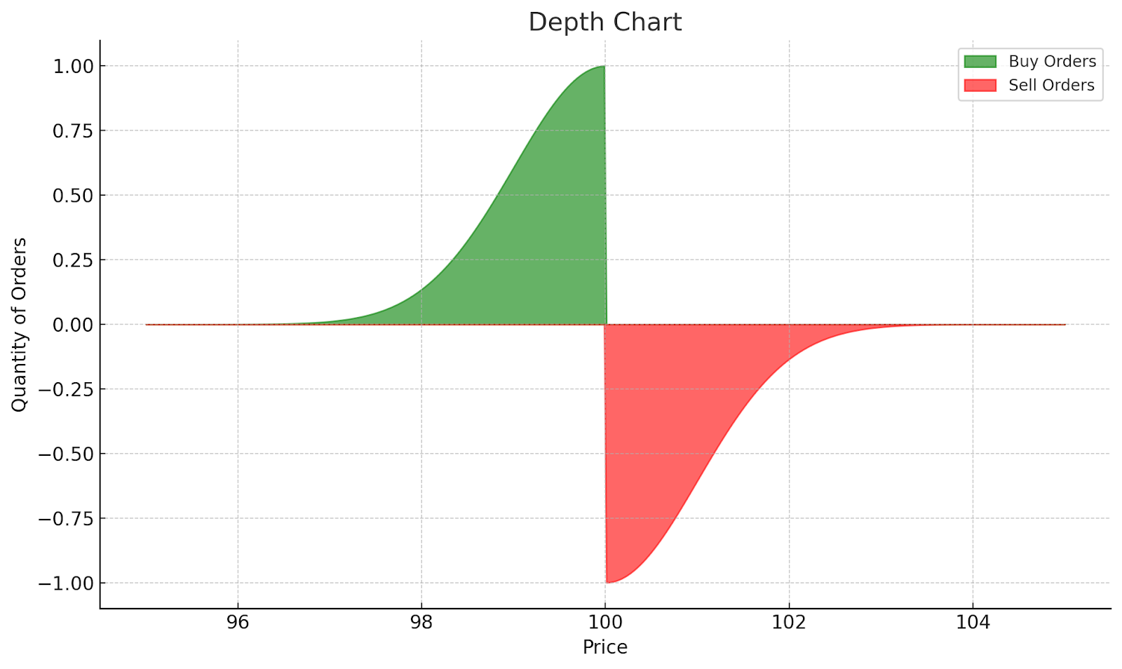
A depth chart represents the supply and demand of an asset at various prices. It is derived from the order book, which lists all pending buy (“bid”) and sell (“ask”) orders for an asset.
The depth chart consists of two curves: a green line representing buy orders and a red line representing sell orders. Typical to graphs, there is also an X-axis representing price, and a Y-axis showing the quantity of buy or sell orders.
Read Also: What is Crypto Swing Trading? Top Swing Trading Strategies
See the image of a depth chart:
Components of a Depth Chart
To accurately read and analyze depth charts, it’s essential to recognize the fundamental components that make up these visual representations of market supply and demand.
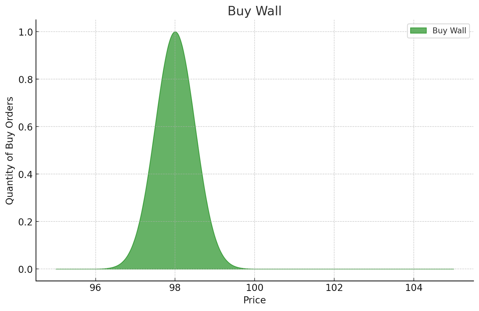
Buy Wall
The buy wall is a steep rise in the green curve on the left side of the chart, representing a large accumulation of buy orders at a particular price. When there is a strong buy wall, it often suggests that traders believe the asset will not fall below that price.
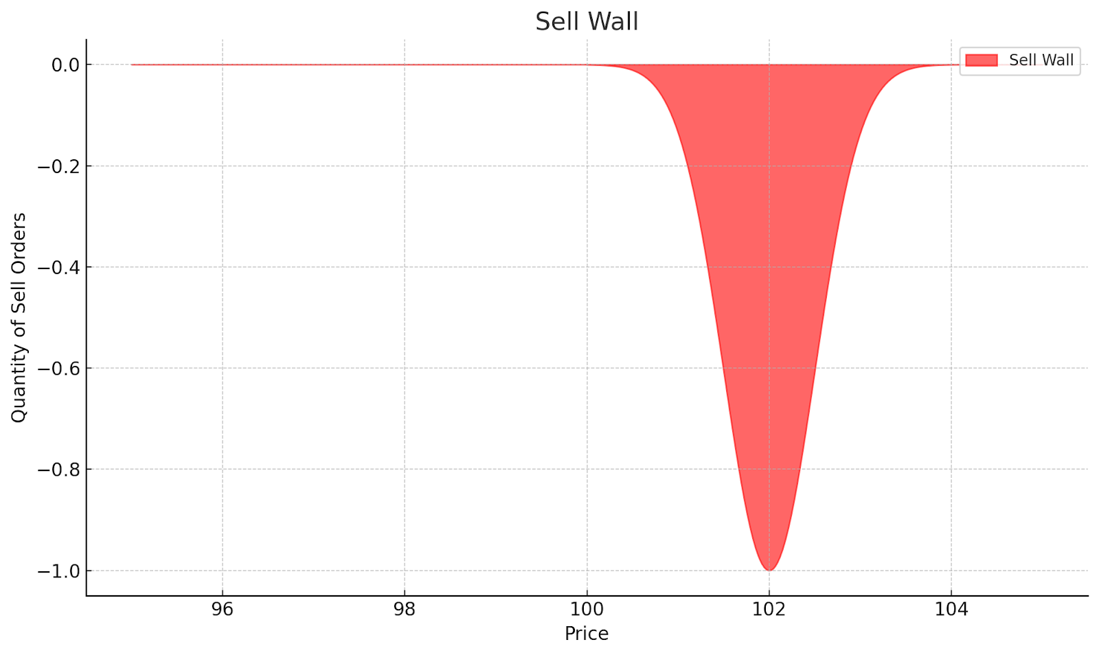
Sell Wall
The sell wall is a sharp increase in the red curve on the right, indicating a significant volume of sell orders. It can signal that traders expect the asset’s price to face resistance and not rise beyond that level.
Horizontal (X) Axis
The X-axis represents the price at which buyers and sellers have placed their orders. Each point on the axis shows a potential trade price for the asset.
Vertical (Y) Axis
The Y-axis shows the quantity of the asset being bought or sold at each price point. The higher the line on the Y-axis, the larger the volume of orders at that price.
Price Range
You can zoom in and out of the depth chart to view different price ranges. Adjusting the price range allows traders to focus on short-term price movements or get a broader view of market conditions.
Market Depth Indicator
This indicator provides a more detailed view of order sizes, executed prices, and the notional values of buys (green) and sells (red) as you hover over various points on the chart.
Why is Understanding a Depth Chart Important?
The truth about trading is – no one is certain of anything. The markets aren’t set in stone and it could feel like plunging into uncertain waters. That’s where depth charts come in.
Reading a depth chart is crucial for gauging market liquidity, and volatility, and predicting price movements. When you’re able to decide the supply and demand forces at play, you can anticipate how an asset’s price will behave and place profitable trades.
But that’s not all. Depth charts also reveal critical price levels where buy or sell orders are clustered – think of them as “walls” where the market is likely to pause or reverse.
Anatomy of a Depth Chart
Quotes
The top section of a depth chart often shows various market data such as the current ask price, bid price, last traded price, and more. This data helps traders keep track of the most recent market activity.
Graph
The main part of the chart, the graph, shows the cumulative buy and sell orders. This is where the buy and sell walls are formed.
Tooltip
The tooltip displays more detailed information as you hover over different sections of the chart. It shows the price level and the corresponding cumulative order volume at that point
The number of users in the cryptocurrency market is projected to reach 107.3 million by 2025 – Forbes.
How to Read a Market Depth Chart
Reading a market depth chart involves analyzing both the buy and sell sides. A steep buy wall indicates high demand at a particular price, while a steep sell wall indicates strong selling pressure.
In other words, If the buy side is stronger than the sell side, the price may be pushed upwards. Also, if the sell side dominates, the price might decrease.
Identifying Buy and Sell Walls
Buy and sell walls are key features of depth charts. A buy wall appears as a steep rise in the green curve on the left side of the chart. This indicates a large number of buy orders at a specific price. Similarly, a sell wall shows up as a sharp increase in the red curve on the right side, representing numerous sell orders at a particular price.
For example, if you see a large buy wall at $30,000 for Bitcoin, it suggests strong support at that level. Conversely, a significant sell wall at $35,000 might indicate resistance to price increases beyond that point.
Recognizing buy and sell walls is crucial for assessing the health and risk of investing in cryptocurrencies.
Interpreting the Shape of the Curves
The shape of the curves in a depth chart can tell you a lot about market sentiment. A gently sloping curve suggests a balanced market with orders spread across various price points. Steep curves, on the other hand, indicate concentrated demand or supply at specific prices.
If the buy curve is steeper than the sell curve, it might signal bullish sentiment, as buyers are more eager to purchase at higher prices. The opposite is true for a steeper sell curve, which could indicate bearish sentiment.
Understanding Market Depth and Liquidity
Market depth refers to the market’s ability to absorb large orders without causing significant price changes. A depth chart helps visualize this concept. The higher the curves on both sides, the more liquid the market is.
For instance, if you see tall, relatively symmetric curves on both sides, it suggests a highly liquid market where large trades can occur without dramatically affecting the price. Conversely, short or asymmetric curves might indicate a less liquid market where large orders could cause substantial price swings.
Spotting Potential Support and Resistance Levels
Depth charts can help identify potential support and resistance levels. Large buy walls often act as support levels, as the high demand at these prices can prevent further price drops. Similarly, substantial sell walls can act as resistance levels, potentially stopping price increases.
However, it’s important to remember that these walls can disappear or shift quickly, especially in volatile markets. A large buy wall might seem like strong support, but the price could drop rapidly if it suddenly vanishes. Always consider the dynamic nature of these indicators when making trading decisions.
By analyzing these aspects of a depth chart, you can gain valuable insights into market dynamics, helping you make more informed trading decisions. Remember, though, that depth charts should be used in conjunction with other analysis tools for a comprehensive market view.
How to Read Depth Charts in Different Market Conditions
Understanding how depth charts behave in various market conditions is important. The appearance and interpretation of these charts can vary depending on whether the market is bullish, bearish, ranging, or experiencing high volatility.
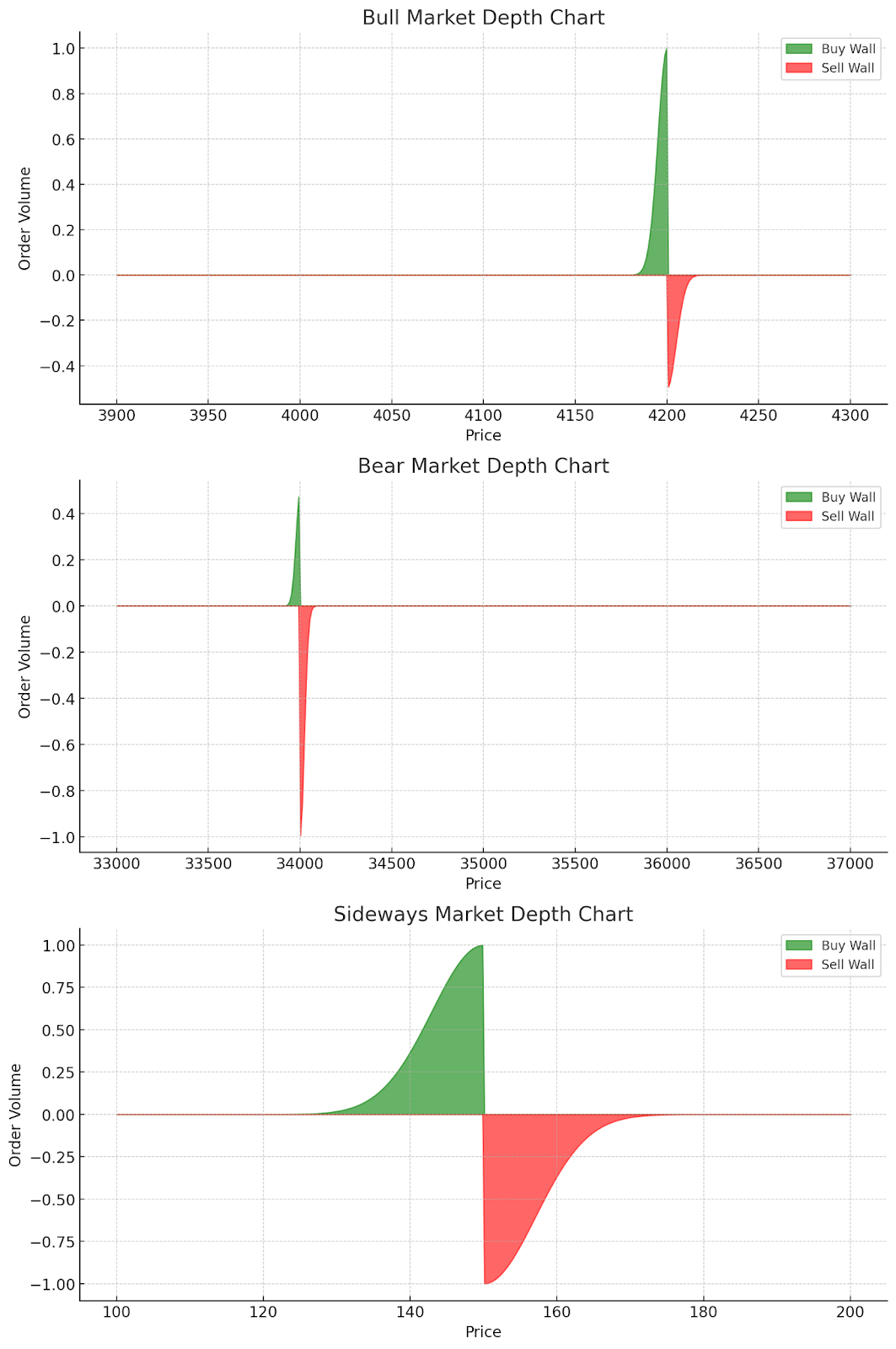
Bull Markets
In bull markets, depth charts often display strong buy walls and weaker sell walls. This reflects the overall positive sentiment and increased buying pressure.
For example, if Ethereum breaks through $4,000 resistance and a buy wall forms at $4,200, it may indicate that buyers are confident in the cryptocurrency’s continued growth. This can confirm upward momentum and suggest the potential for further price increases.
Bear Markets
During bear markets, you’ll typically see more prominent sell walls and weaker buy walls. This represents the prevailing negative sentiment and increased selling pressure.
When the price of a token dips and there is a strong buy wall, it could be an indicator of investor confidence in the cryptocurrency’s long-term potential, even amidst bearish conditions. This can signal support from institutional investors or whales and potentially reverse prices.
For instance, if Bitcoin’s price drops to $35,000 and a high buy wall forms at $34,000, it may indicate that buyers are eager to purchase at that level, potentially reversing the downward trend.
Sideways Markets
In sideways or ranging markets, both walls are relatively balanced. This equilibrium often results in price consolidation.
During these periods, depth charts can help identify the upper and lower bounds of the trading range. Strong buy walls at the lower end and sell walls at the upper end of the range can indicate where the price might bounce or face resistance.
Integrating Depth Charts with Other Trading Tools
Depth charts provide a snapshot of current order book status but don’t account for factors like news events, overall market trends, or trader sentiment. It’s important to use it in conjunction with other trading tools and techniques.
Read Also: How To Read Crypto Trading Charts
Price Action Analysis
Combine depth chart analysis with price action patterns like support/resistance levels, trend lines, and chart patterns for a more comprehensive view.
Volume Indicators
Use volume indicators alongside depth charts to confirm the strength of buy/sell walls and potential breakouts.
Technical Indicators
Incorporate technical indicators like RSI or MACD to supplement depth chart analysis. For example, a strong buy wall coupled with an oversold RSI might provide a stronger buy signal.
Final Thoughts
One of the most interesting tools for any trader to have in their arsenal is the depth chart. Learning how to read a depth chart, including buy and sell walls, will help improve your trading process.
Remember that a depth chart does not always show hidden liquidity and is best used with other trading tools and strategies.
Frequently Asked Questions
What is a depth chart in cryptocurrency trading?
A depth chart is a visual representation of the order book for a cryptocurrency, showing the supply and demand at various price points. It consists of two curves: a green line representing buy orders and a red line representing sell orders.
How do I interpret buy and sell walls on a depth chart?
Buy walls are steep rises in the green curve on the left side of the chart, indicating a large number of buy orders at a specific price. Sell walls are sharp increases in the red curve on the right, showing significant sell orders. Strong buy walls suggest support levels, while sell walls indicate potential resistance to price increases.
What does the shape of the curves in a depth chart mean?
The shape of the curves provides insights into market sentiment. Gently sloping curves suggest a balanced market, while steep curves indicate concentrated demand or supply at specific prices. A steeper buy curve might signal bullish sentiment, while a steeper sell curve could indicate bearish sentiment.
Can depth charts predict price movements?
While depth charts can provide valuable insights, they shouldn’t be used as the sole predictor of price movements. They offer a snapshot of current market conditions but don’t account for external factors like news events or overall market trends. It’s best to use depth charts in conjunction with other trading tools and analysis techniques.